Heatmaps are useful tools to fill in the gaps that website analytics can't show us. Since heatmaps are more visual in nature, they give us valauble insights into what content visitors are reading and if your call-to-action buttons are working well.
Jump to Recommendations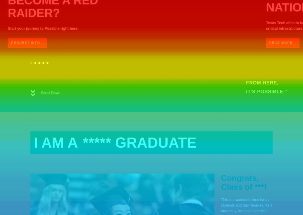
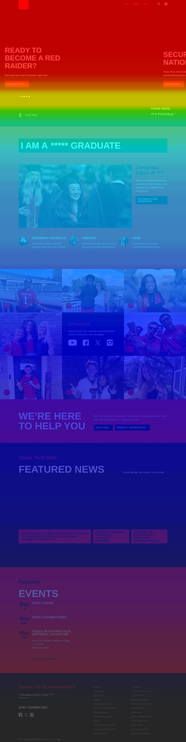
The Texas Tech homepage is built well but follows a trend in higher education over the past 10 years. While it provides a lot of useful information, the 25% of visitors reach the bottom of the page. Often, users will miss the News and Events section.
The "I Am A" section is fantastic, but the clickmap shows that users prefer to use the main navigation or internal search function to find the content they are looking for.
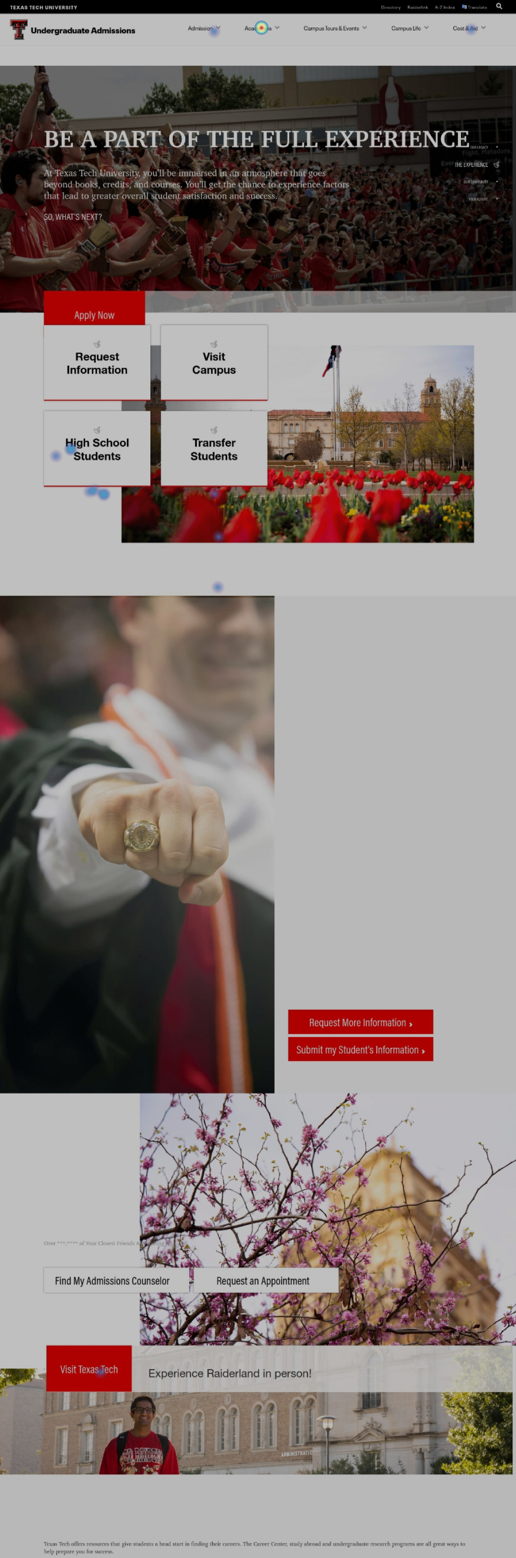
The Undergraduate Admissions landing page is a jumping off point for a lot of information. We expect this page to scatter traffic in different directions due to a student wanting to review cost and academic information before they are ready to apply, visit campus or request information.
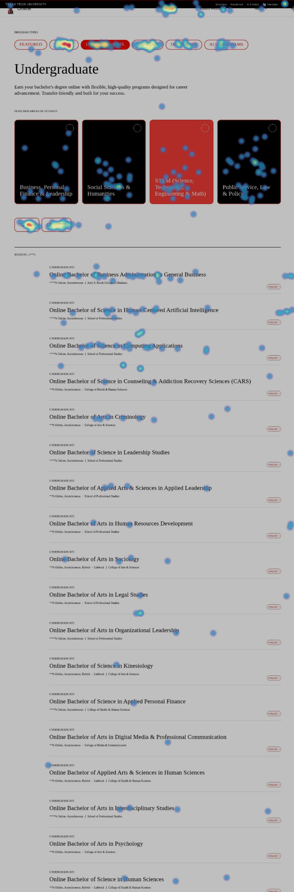
Analytics showed us that the Online program pages are some of the most highly trafficked on the site. The heatmaps show very high engagement across the board. Specifically, the program pages seem to be laid out well due to high readability all the way down the page and evenly-dispersed clicking on the available call-to-action buttons.
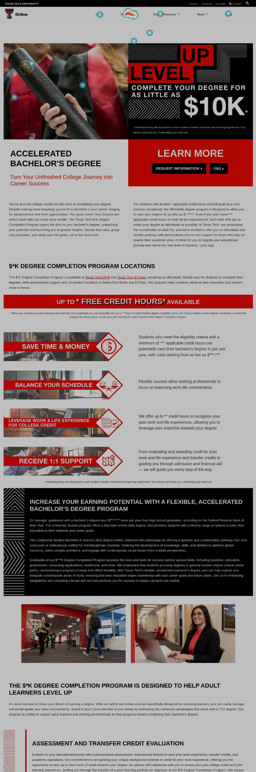
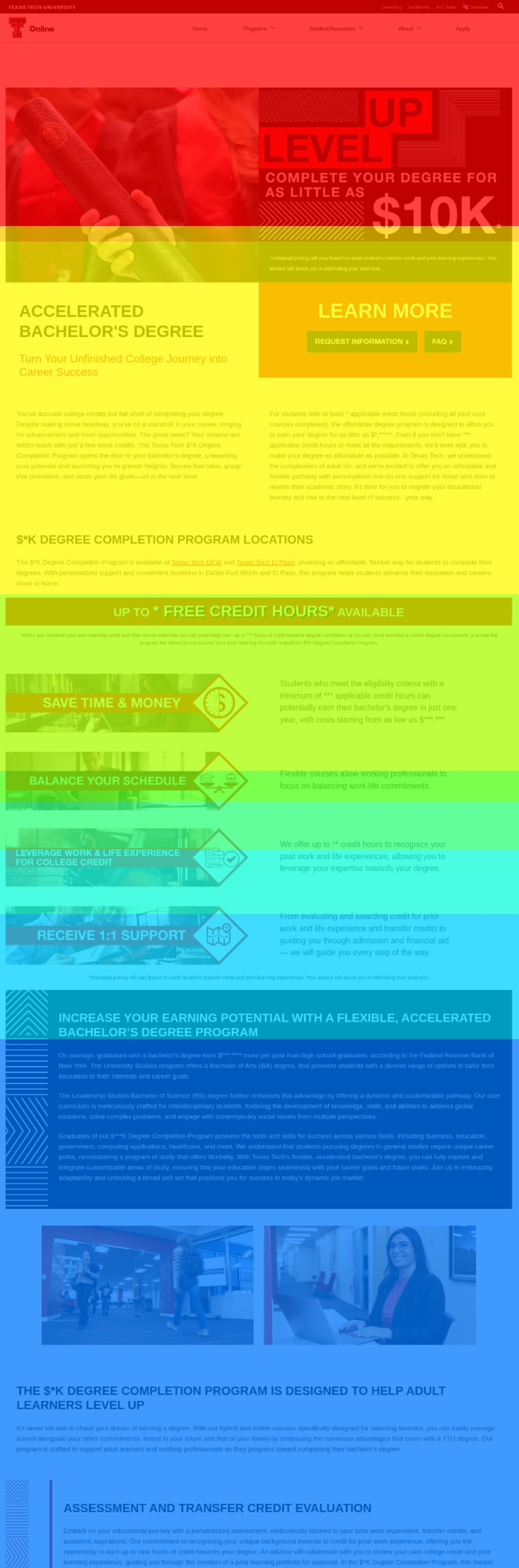
The Online 10K Landing page does a good job of introducing what the program is and how it works within the Texas Tech system. The clickmap reveals the immediate next step are visitors looking for programs with the Online 10K program.
It indicates that users may be coming in more informed and just wanting to understand what programs offers first.
The scrollmap for the same page also indicates that 50% of visitors are getting halfway down the page and then going back to look for programs.
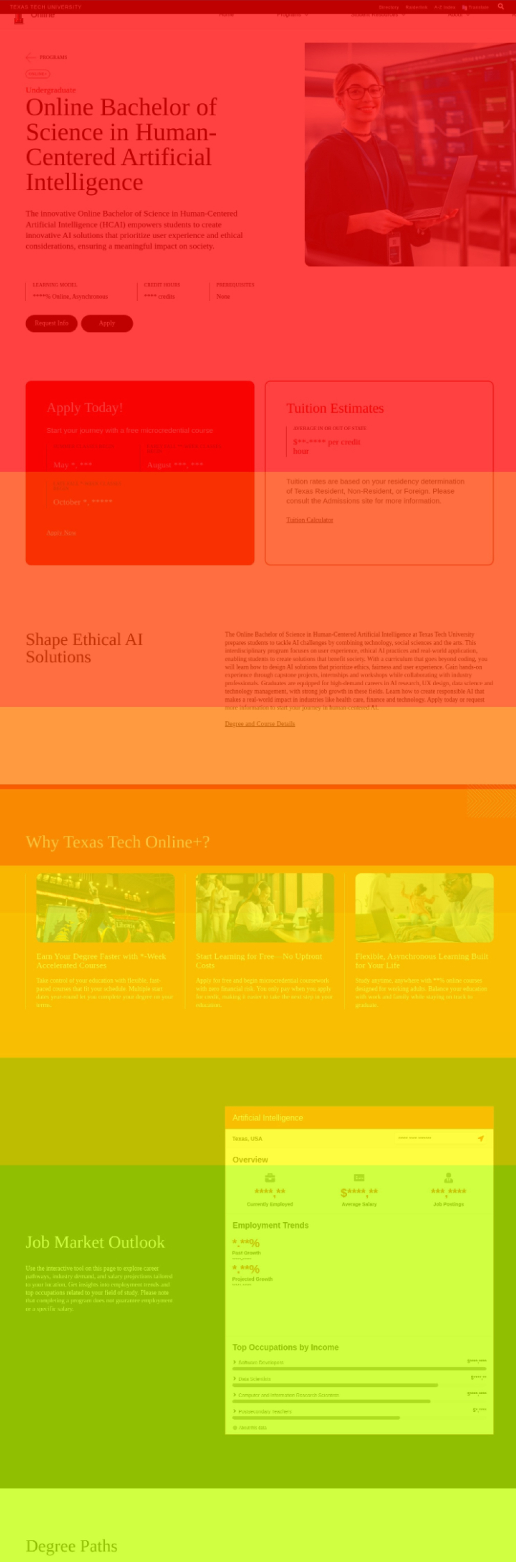
The Human-Centered AI program page is the single most popular program on all of the Texas Tech website. The scrollmaps and clickmaps indicate this as well.
Program pages are what we consider to be "dead end" pages. This means that a user will read almost ALL content on the page no matter how long it is.
These pages can be the first introduction to the Texas Tech brand so it is important that all program pages follow the same setup.
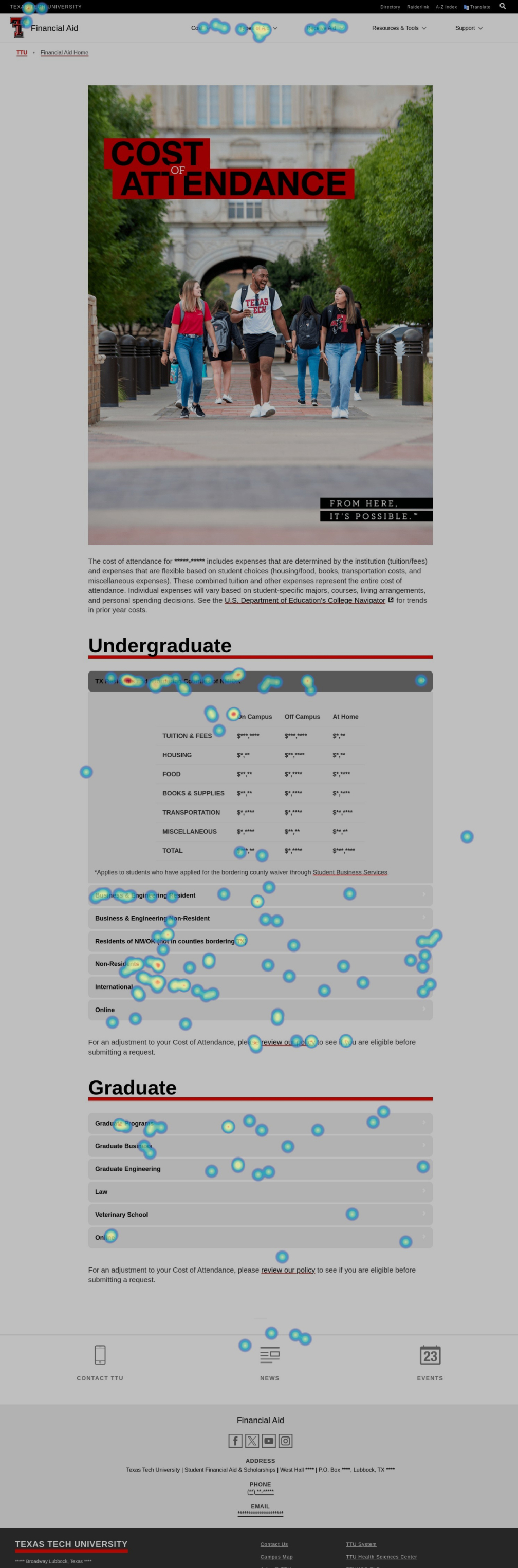
The Cost of Attendance page is another example of a "dead end" page. The table in the middle of the page with the layout of the cost is exactly what prospective students and parents were looking for.
Once visitors have the cost information, the clickmap shows they are interested in "affordability" content and answering the question "How do I pay for this?".
Heatmaps
The heatmap software allows our team to record user sessions and see exactly how they scroll and click on your website. We have saved several recordings that support findings in other areas of our research.
In this video, a prospective master's student is looking for online program options.
In this video, we are observing a potential online program prospective student reviewing various programs. We find that the user may be overwhelmed by the number of filters and options available in the various dashboard pullouts and dropdowns.
This video assumes an incoming freshman interested in costs and how to pay.
It is important to review videos of mobile site visitors as well. This video reveals that the student is interested in cost and scholarships information. The content for cost and scholarships is separated so they student must navigate across multiple sites on her mobile phone.
This shows us there could be a better way to present affordability information to shorten the search time for students and parents.
Heatmap Observations
It is clear observing the behavior of your users on the old templates vs. the new templates (online) that the improvements have made a big difference. The scrollmaps indicate users are reading a larger chunk of the content and the clickmaps indicate good engagement on the “dead-end” pages.
The homepage of any university is always a strong focal point. However, engagement rates on the page always raise questions to what users actually want to see. For example, the audience selector “I Am A....” is a fantastic idea that technically would resolve some of the feedback we received in the survey, but it is curious that we have less than 1% engagement on that section of the website. TTU may have a case to explore a more simplified homepage that treats the experience as more of a dashboard or jumping off point.
The recording of the student on their mobile device shows a great example of the pathway of high-school student / incoming freshman. Starting from the homepage, they immediately look for scholarships. They use the website’s internal search functionality to look for tuition and cost but does not seem to find exactly what they are looking for. At the end, they finally find the page with the Resident/Non-Resident costs laid out in the table.
The clickmaps show that in almost every instance, if “Programs” or “Academics” or “Majors” were an option in the navigation, it was always a Top 2 link. Through observing recordings, this is most likely due to users not finding the program pages for their desired major unless they were trying to find an online program. In some cases, you have to either navigate to the School/College or the Admissions page to find the correct location.
The recording of the prospective online student shows how someone is using the new filters on the online degree program pages. In that example, they are trying to determine whether or not their program qualifies as “Online+” or just regular “Online”. You can see them search and filter multiple times but it isn’t clear through observing if they figured out how it works.