

This phase of the audit included content audits and research into specific sites selected by the Marketing team. Each site was the subject of its own standalone audit, including heatmaps, user recordings, and content strategy.
Directed at internal audiences, the site does not sell the university's strength in research.
This academic page reflects many issues seen across the site on college and department pages.
These pages are highly effective, so we take a closer look at content hierarchy and perfecting them as models for all program pages.
A brief look at this authentic and informative, but somewhat hidden content.
Insights from Content Audit
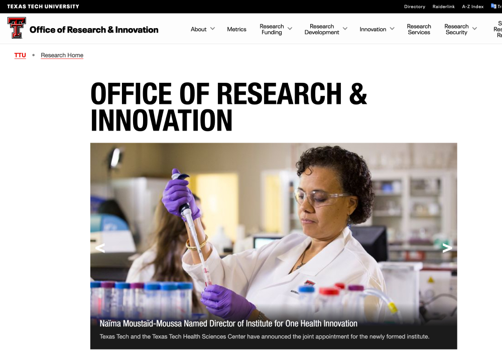
The Office of Research and Innovation’s landing page does not contain any copy or content that indicates what the website or department does. The main images showcase the latest news but the “How Can We Help?” is geared towards an internal audience only. The navigation reveals over 25 different paths to take located in different sections of the research website and can be overwhelming.
The Office of Research and Innovation website offers a robust set of helpful links, forms, information and contacts for anyone looking. However, it does not sell the university’s strength in research. A revised website for the Office of Research should take cues from the Strategic Research and Innovation Hub’s pages deeper within its architecture to help market TTU.
Due to the various uses of the TTU design system, it is difficult to tell where you are. Each department within the Office of Research has its own approach to design and content leading to some web pages with only text, and other pages with an exceptionally modern (and never before seen) design system. This problem is exacerbated by the over-reliance on the navigation drop-down system to house links within the site (especially when the links open new windows.)
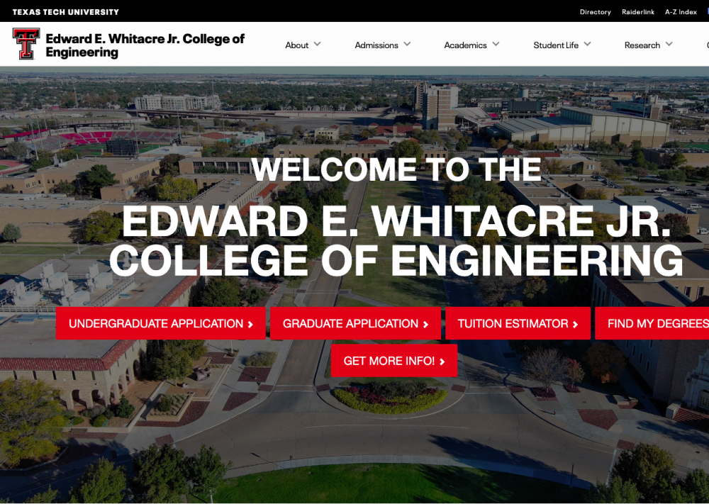
With only using an automated accessibility checker, the current CoE pages could pass minimum accessibility standards, but examining the pages more closely (in particular on mobile) reveals severe usability and accessibility issues. Hidden content behind flip cards, inability to click on mobile, and sticky navs prevent some users from being able to fully read important content related to academic programs.
Globally, the TTU.edu website will send users to the catalog for course related information on the main academic page. The CoE has their own dedicated program pages for their content that also directs users to the catalog page. In addition, there are calls-to-action like apply, request information and contact that make it unclear who exactly the student is contacting: the College of Engineering or TTU Admissions.
There are several instances on the CoE where an entire page of information is duplicated, in particular information related to prospective students. While direct links may be provided to more specific content, single pages are created with more links to the same content. In addition, the usage of the navigation drop-down, in-page links, and secondary navigation creates search overload with your users.
The College of Engineering (and various other colleges) have several design systems embedded within its own architecture. The high-level pages (CoE) are based on templates that are a different version than the departmental pages (The Department of Computer Science, etc).Since the subset of available templates and content types are so large, it is difficult for web editors to adhere to a standard when building pages for their respective departments.
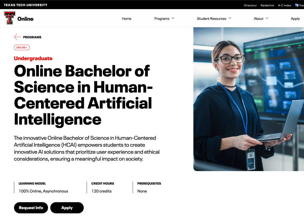
Program pages are what we consider to be “dead end” pages. In other words, your audience has found one of the main pieces of information they were looking for when they first arrived (i.e. Cost, Majors, Fit).
These pages can be much longer and dense than other pages on the website since the user will most likely read everything. The clickmap and scrollmap indicate that not all content is being engaged with but may also indicate there could be other opportunities. In this case, AB test potential changes to the page instead of making wholesale updates.
All available data, including GA4 and heatmaps, indicate that the Online+ program pages are highly effective. In fact, we would recommend that on-campus program pages have a similar layout that includes the same available information. While the “time to purchase” for an Online degree is much shorter, the information your prospective students need is exactly the same.
Each site has its own unique design quirks but no singular site made us think “Why is this here?”
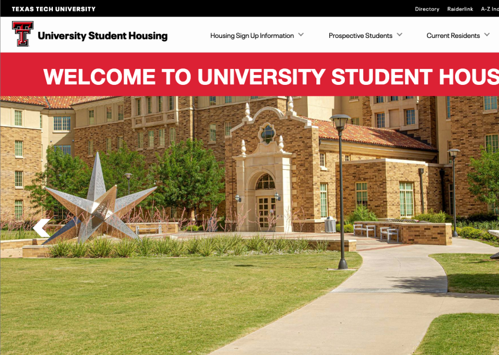
In particular, the Housing site does everything it is supposed to do and more. The virtual tours of the dorm rooms are thoughtful and detailed and give the students (especially international students) a better look behind the scenes. The content on all of these sites feel the most “authentic” to the student and could be because a student wrote the content.
Thinking about the prospective student journey, we know that students are very interested in the dorms (especially the cost), food, athletics, and other accommodations. However, these sites serve a very particular purpose with the current student in mind. In the recordings and page flows we examined, prospective students rarely find these websites unless there is something transactional they need to do. It would be interesting to think about how to pull some of the culture and life these pages bring to content in other sections on the Admissions and Academic pages.