
We believe that a healthy mixture of quantitative and qualitative research can lead to real insights.
At the end of the day, sitting down with real humans makes the difference in how we understand your website and your brand. These research pages are the first steps in building a diagram of what we need to do in order to build a better next generation website.
An online intercept survey that asks 3-4 questions in order to get a broader set of responses.
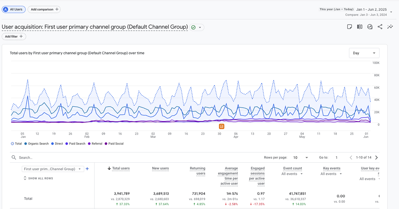
A deep dive into your Google Analytics setup to see how users are engaging with your website.
A visual look at how users are engaging and interacting with your website.
An in-person workshop geared towards creating priority and consensus with a large subset of people.
Insights from Research
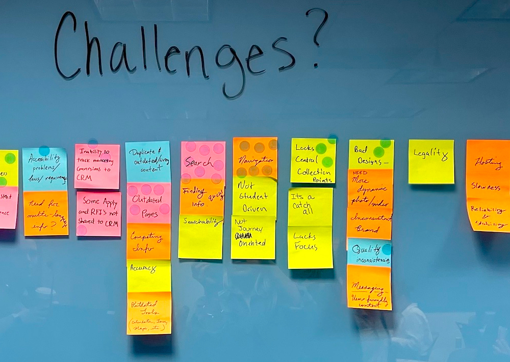
“Content” overall is a reoccurring theme in the feedback. Specifically, users mention outdated information, unexpected information, or just simply too much information.
During the period the survey was live, the largest group of respondents were parents/grandparents/guardians. Since this group tends to be older, it isn’t a surprise there were more accessibility related feedback.
TTU should consider how the bright color in the red is used, how the navigation works, and the website displays for mobile devices in the next generation of the website.
By percentage, the respondents indicated they were interested in:
This response aligns with other data that we’ve collected in the audit and also aligns with our in-person sessions as well.
There were many comments, mostly from current students and parents, about the many different portals that are available. Specifically, the names of the portals seem to cause confusion about their content and what purpose they serve.
While TTU does not differ from other universities and their vast ecosystem of internal systems, we should consider simplifying how your audiences find and log into these platforms.
Small adjustments into how analytics reports data (full URL, event conversion tracking, demographics) could help tell a more accurate story of user behavior.
Specifically, the conversion tracking can help with illustrating user funnels and show what users did on the website before performing a key action.
In 2025, online programs and the marketing around those options have been particularly strong. The $10,000 online degree seems to be extremely popular with your audiences across the board.
The online degree market is extremely competitive, and connecting your analytics to the online degree program CRM can help the TTU marketing team make adjustments/tweaks during campaigns to stay in front of the competition.
Internal search shows similar trends in behavior compared to our other research. Tuition/cost, financial aid, scholarships and majors are all critical content for non-current students.
It is important to note that there is a relationship between the keywords tuition, cost, financial aid and scholarships. These are all related to paying for an education, and depending on where a student (or parent) may be in the journey could determine the phrasing used.
Full URL paths may need to be implemented in the future to distinguish between many depts.ttu.edu websites with similar URL paths. For example, the homepage of most websites will simply report at “/” but it isn’t clear what website it is from.
Conversion tracking (key events) should be implemented once we can track true conversions in the CRM (RFI, Visit Forms, Admissions, Donate, etc.) This will help us determine the efficacy of paid marketing efforts vs. organic.
We also reviewed analytics for sites in the Content Audit.
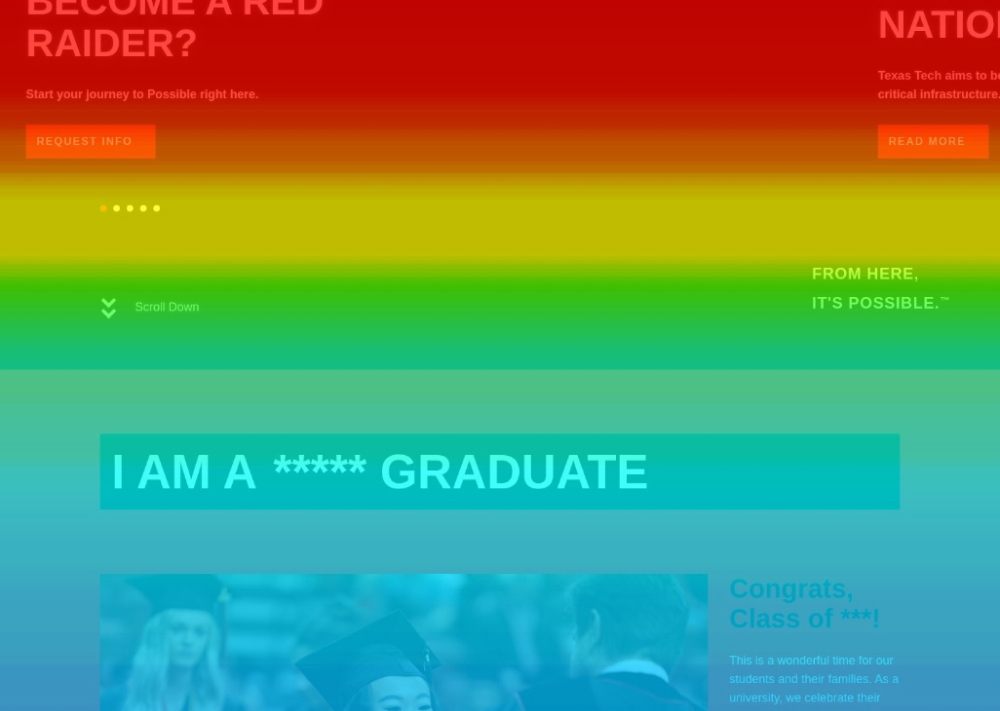
It is clear observing the behavior of your users on the old templates vs. the new templates (online) that the improvements have made a big difference. The scrollmaps indicate users are reading a larger chunk of the content and the clickmaps indicate good engagement on the “dead-end” pages.
The homepage of any university is always a strong focal point. However, engagement rates on the page always raise questions to what users actually want to see. For example, the audience selector “I Am A....” is a fantastic idea that technically would resolve some of the feedback we received in the survey, but it is curious that we have less than 1% engagement on that section of the website. TTU may have a case to explore a more simplified homepage that treats the experience as more of a dashboard or jumping off point.
The recording of the student on their mobile device shows a great example of the pathway of high-school student / incoming freshman. Starting from the homepage, they immediately look for scholarships. They use the website’s internal search functionality to look for tuition and cost but does not seem to find exactly what they are looking for. At the end, they finally find the page with the Resident/Non-Resident costs laid out in the table.
The clickmaps show that in almost every instance, if “Programs” or “Academics” or “Majors” were an option in the navigation, it was always a Top 2 link. Through observing recordings, this is most likely due to users not finding the program pages for their desired major unless they were trying to find an online program. In some cases, you have to either navigate to the School/College or the Admissions page to find the correct location.
The recording of the prospective online student shows how someone is using the new filters on the online degree program pages. In that example, they are trying to determine whether or not their program qualifies as “Online+” or just regular “Online”. You can see them search and filter multiple times but it isn’t clear through observing if they figured out how it works.
The students we were able to speak to (although it was not many), confirmed that their prospective journey was pretty simple.
The students indicated that the many portals and platforms were very frustrating - especially during the “Admitted” process where they were trying to finalize becoming a student. One thing of note that all students repeated is that once they reached a real person, the process was a lot easier. It is also of note that the efficiency of the Admissions process is a huge boon to TTU. Fast decisions clearly help students make an easier decision. Overall, they just want to know.
This may be one of the first times we’ve seen a robot be selected as a top audience but it makes sense. Prospective students and parents today rely on Gemini, ChatGPT and other technologies to give them simple and quick readouts of the information they want.
Getting the exact output without having to scan the entire website is appealing and saves a lot of time. This puts pressure on the marketing team to make sure the website serves the most up-to-date information in a way that’s appealing to people AND robots.
These students were sharp. They understood the concept of a net price but they were more interested in the process of getting to the net price. TTU’s scholarships, especially for in-state, bordering and international students are incredible. Once that formula is figured out for those that qualify, it’s a huge driver.
This was also apparent on the tour during the presentation.
A lot of universities understand the importance of outcomes. Not just going to college for the experience but knowing that there has to be a job at the end of the journey (or a least a high chance of a job.)The TTU students were really interested in outcomes. But it also seems that they took extra steps to verify that by looking deeper into alumni and the jobs they had. The new program pages do a great job of showcasing job and salary data but this is a great opportunity for the other trad. programs as well.
Insights from Research
Just in our preliminary research, we can start to see the outline of the prospective student journey. There is a lot of nuance to the overall end goal of applying and becoming a student, but it still very simple.
Cost, Majors, Fit.
If we answer these questions along their journey, and simplify how they receive that information - TTU will have a better chance of converting more Red Raiders (and robots.)
See the Journey Map for details about our customer journey recommendations.
TTU’s paid campaigns are clearly driving a large amount of traffic to the website - especially towards online degree programs. The question remains on whether the incoming traffic is qualified traffic. Identifying the areas of interest for your paid traffic is key and will allow TTU to make adjustments to the spend, keywords and tactics that will make your marketing apparatus more efficient.
Connecting your CRM to analytics will make this goal a lot easier.
The Texas Tech University campus in the largest campus in the U.S. But the website does not have to be. The data suggests that a simpler website will provide a huge sigh of relief to your users (and web managers!).
It will be important through our work to identify all of the content you don't need and remove it if all possible. By working through the identified customer journey, this will help make that task easier.
It’s a feeling you that you know it when you see it. The website is only a small part of the vibe but it’s important to think about where prospectives begin to understand what TTU is all about.
A good place to start is the tour that can be an AHA moment for a lot of students. The virtual tour should support the in-person tour. Where are the moments that a tour guide stops and shows you something incredible? Are those moments available anywhere else? How do we capture that magic?
On & On...