The Research and Innovation homepage speaks to an internal audience, with external content buried deeper within the site. Design language within the site is inconsistent and makes it difficult for users to tell where they are.
Jump to Recommendations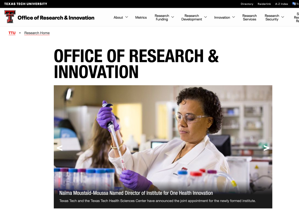
Research and Innovation
While analytics don't always provide deep insights about behavior, they do demonstrate what people are doing on your site.

Data shows a lot of internally-focused content. Some pages do appear to be targets of pay-per-click campaigns based on the low engagement times. That doesn't necessarily indicate a problem, just areas for further investigation.

Sources do reflect that paid advertising is driving some traffic. Short engagements don't necessarily mean that the campaigns are ineffective, but our preliminary audit did indicate that there are no key events set up in analytics. Key events tell Google that certain behaviors are very important and should always be tracked. This helps us track the effectiveness of a campaign and is needed to determine if the paid advertising is working.
Research and Innovation
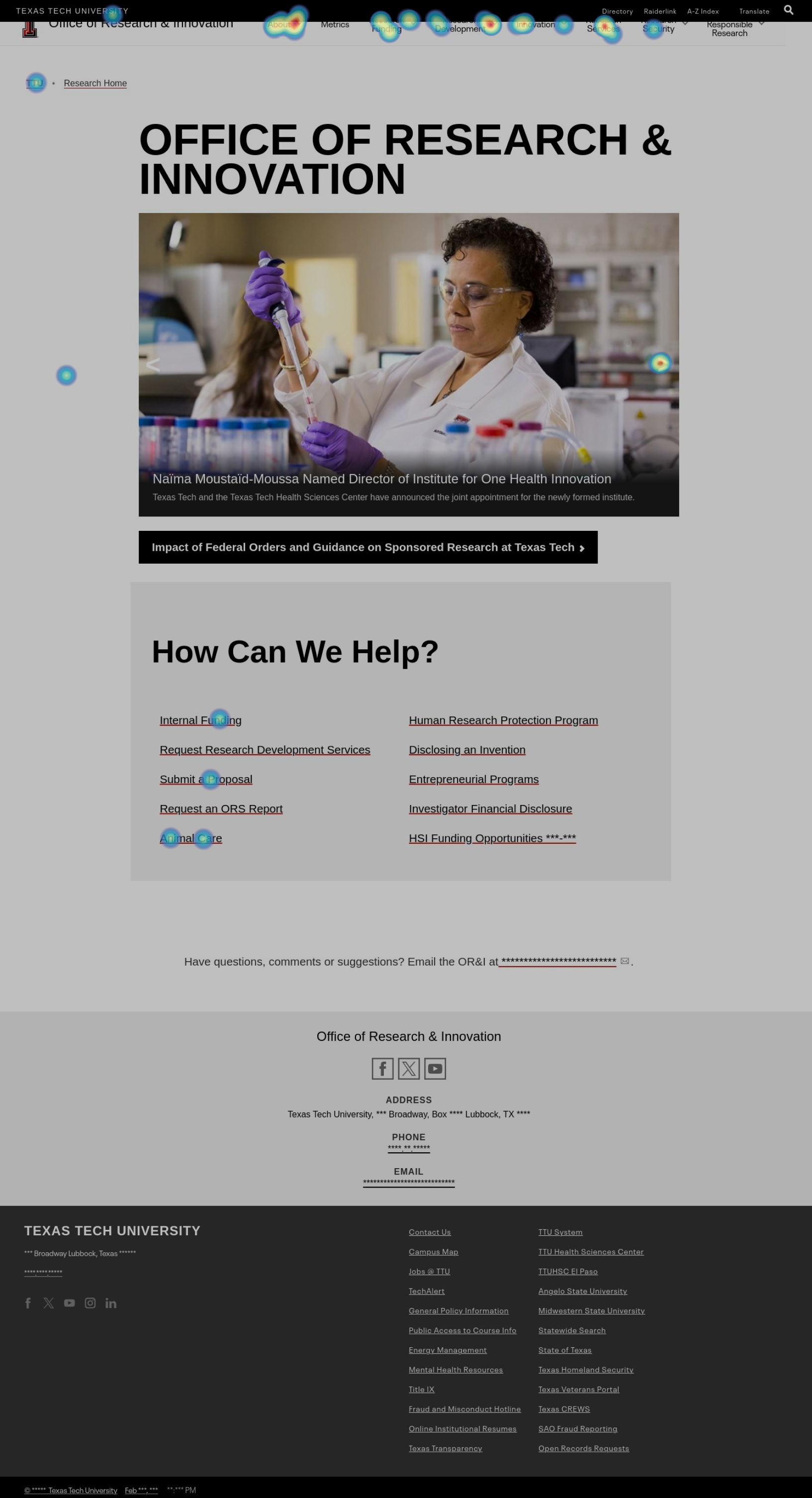
The click mapping tool shows that the most clicked items from the homepage are:
Internally, a lot of staff are going to about and then clicking the staff directory. There are a lot of clicks on the carousel, but few actually engage with the articles within it. Much of the content is directed at an internal team, rather than selling TTU's strength in research.
Research and Innovation
Research and Innovation
This is a more unique page, design-wise. This video walks through the homepage. The design is well done and has a unique voice, but the navigation breaks down.
[video upload to vimeo then add url]
This is a common theme across all TTU sites — the global navigation is abused and stuffed with links that are only accessible from this nav. We recommend enforcing more rules about how the global nav is used, and educating web teams on how to best use this component.

Research & Innovation Site
Option to intro the rec content...
The Office of Research and Innovation’s landing page does not contain any copy or content that indicates what the website or department does. The main images showcase the latest news but the “How Can We Help?” is geared towards an internal audience only. The navigation reveals over 25 different paths to take located in different sections of the research website and can be overwhelming.
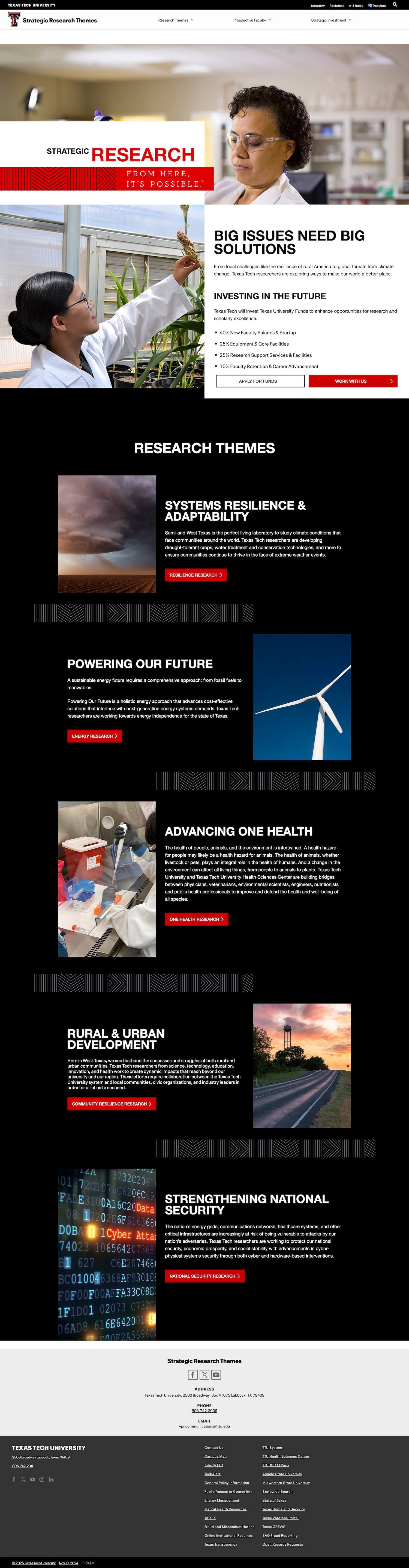
The Office of Research and Innovation website offers a robust set of helpful links, forms, information and contacts for anyone looking. However, it does not sell the university’s strength in research. A revised website for the Office of Research should take cues from the Strategic Research and Innovation Hub’s pages deeper within its architecture to help market TTU.
Due to the various uses of the TTU design system, it is difficult to tell where you are. Each department within the Office of Research has its own approach to design and content leading to some web pages with only text, and other pages with an exceptionally modern (and never before seen) design system. This problem is exacerbated by the over-reliance on the navigation drop-down system to house links within the site (especially when the links open new windows.)